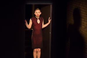
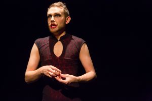
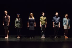
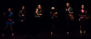
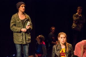
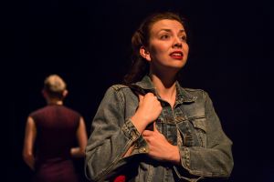
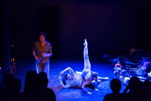
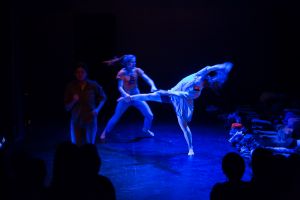
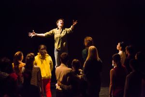
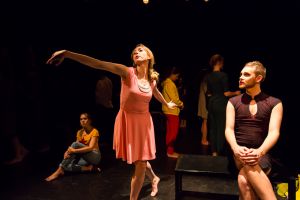
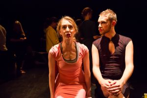
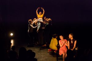
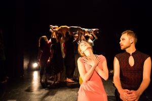
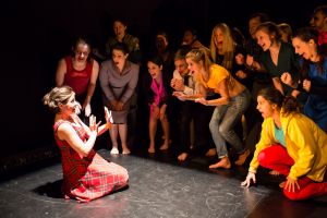
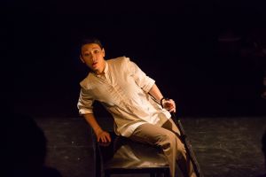
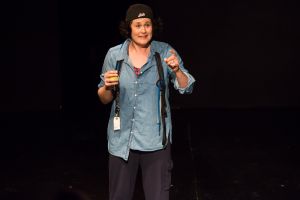
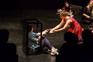
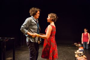
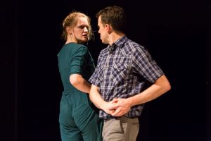
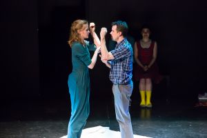
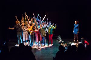
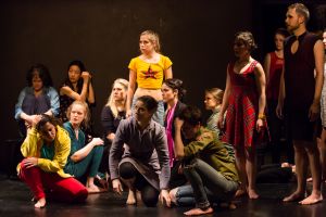
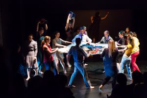
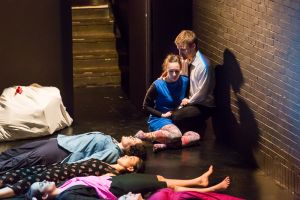
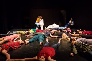
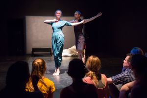
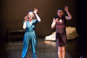
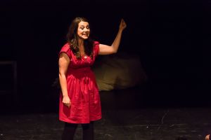
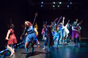
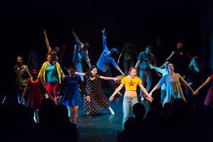
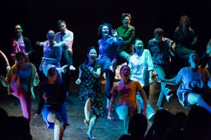
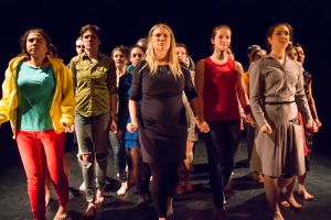
I’ve had a close relationship with SITI Company for several years now. I started training with them about seven years ago and what I learned fundamentally changed my relationship with the theatre and my process as an artist. It even colors how I approach photography. I’ve been wanting to shoot a SITI show for some time now, but they have a relationship with the wonderful Michael Brosilow, whose work has been inspirational to me. But last year, SITI started their conservatory. A nine month full-time program to teach a new generation of artists how to create using the processes, tools and sensibilities that SITI has refined in its years of exploration as a company. The culmination of this program is a devised piece of theatre created by the students and SITI Company, under the direction of company member Leon Ingulsrud. And Leon asked me to photograph their show —This is How I Don’t Know How to Dance (TIHIDKHTD).
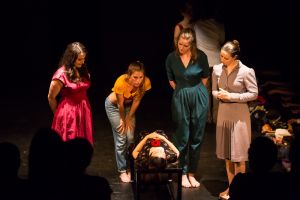
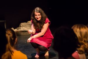
I had seen a sneak preview of the show a couple weeks prior and I knew the space they were using, The Barrow Group Theatre, where I had shot The Tragedy of King Arthur. So I knew two things: 1) I had 20 performers wringing every millimeter of space out of a moderately sized space. 2) I knew some low angle shots were going to serve the stage pictures well and, since it’s a raked audience from stage floor to the back of the house, I knew I needed to be in the front row. This meant I needed the final piece to my puzzle. The missing panel in the triptych. The last item in a fulfilling list of three things! I needed a wide angle lens. I ran into this issue back on Luft Gangster, actually in this same building, albeit in a different and smaller space, and I knew a wide angle lens was going to be an eventual necessity. I knew I needed f/2.8 or faster, because… theatre. I wanted as wide as I could go without going fisheye and obviously I needed good image quality. In the months since Luft Gangster I’ve been researching and there was only one real contender: Canons EF 16-35mm f/2.8 L II USM. So I’m now covered from 16 – 200 mm (400 with my 2x extender 🙂 ). I also knew that I was going to go back on Saturday and shoot the matinee performance from the back of the house and that would be exclusively on my 70-200 mm f/2.8, so I could be a little more creative and cover anything I might miss later.
On to the show!
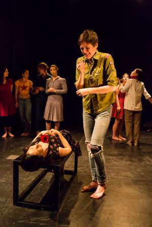
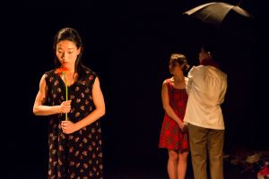
Leon’s first words to me when I entered were “It’s a Darth Vader show.” I looked at him, puzzled. “It’s on the dark side.” Yep, that f/2.8 was the right choice! Up goes the ISO! I shot the whole thing at ISO 5000/6400, which isn’t crazy, but certainly not optimal. While there were some moments that were VERY dark, the biggest challenge was actually contrast. Often there were performers in very bright lighting, while others were in darker areas and often interacting, so you either expose for the person in the light and lose the other in shadow or vice versa and let the bright performer blow out. Well, it is easier to recover detail from shadow than from blown out whites in Lightroom or Photoshop, so generally I split the difference a little, slightly overexposing the brighter actors, which I could fix in post without losing detail and not have to recover as much out of the shadows.
The lighting challenges did prompt me to make one major change in my regular camera settings. Normally I use Evaluative Metering to judge exposure. This means the camera looks at everything in the viewfinder and tries to set the exposure so the whole thing evens out to about 18% grey. With a evenly lit scene, it gives a decent idea of exposure and since I shoot in manual mode, the metering is a suggestion to me — it doesn’t change any settings. The pitfall of evaluative is if there is a very dark subject matter (say someone in a black tuxedo against a black wall), it will tell you the scene is underexposed unless you change the settings (or add flash) until all that black looks 18% grey. Same thing in an all white scene. It will prompt you to make your settings lower until the white is grey. For this show, the Evaluative Metering kept trying to increase exposure until everyone’s skin was blown out, since so much of the rest of the scene was dark. So I tried Spot Metering for the first time. Spot Metering does what it sounds like — it judges the exposure based on one spot in the viewfinder. I could quickly meter someone’s face, judge the settings, compose and shoot and have much better results, much more consistently. Definitely a new tool in the toolbelt. So thanks, SITI Conservatory, for that lesson!
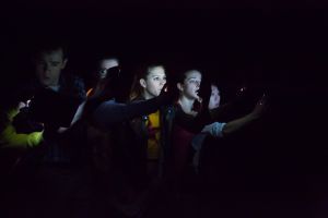
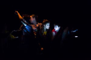
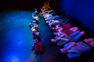
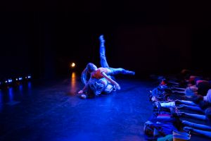
Several moments were in extremely low light. Like almost none. Lit by cellphone screens or just very low, blue washes, nothing was going to help but moving the triangle of aperture, ISO and shutter speed to the extreme and I was out of aperture. I really didn’t want to go much higher with ISO, because of noise, but I guessed that there would probably not be much fast motion in the dark. So I started dropping the shutter speed, braced the camera as well as I could to reduce shake and hoped for the best. There were some nice results. There is a whole “dream ballet” sequence with the performers lying against a wall “asleep” while doing choreographed group movement. A shutter speed of about 1/3 of a second, the motion added a dreamy quality to the images. As some of the performers moved into the main playing space, the light came up a bit, but the shutter speed still was low enough (1/40, 1/60) to add a little motion blur to the choreography, which I quite like.
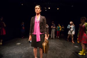
Getting the wide angle for this show was so very much the right choice. There are several moments where performers are looking directly out into the audience and being below their eye line was just the look I wanted. Above them and their view gets shortened and at the same level they are often looking right into the camera — but slightly below, their gaze seems to be infinite, extending above and beyond you.
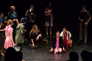
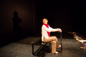
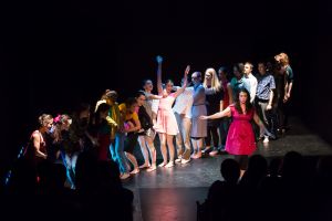
I was not expecting much from the Saturday matinee — I was in the next to the back row and the house was pretty much full. Despite the relatively steep rake of the audience, there were still heads which would be in shots for things happening near the front of the stage. I needn’t have worried. Yes, there are some silhouetted heads, but the higher angle did grant, literally, a very different point of view and one that still offered great images.
